
Meta Learners_for Heterogenous_treatment_effect_estimation
Towards application of Meta‑Learners(S/T/X)
Notebook on a public dataset (RAND Health Insurance Experiment via statsmodels)
Similar to Chapter 9 of Molak, you’ll see:
- ATE vs CATE/HTE
- Propensity scores + overlap checks
- ATE via propensity score matching (PSM) and IPTW
- CATE via S‑Learner, T‑Learner, X‑Learner
- Diagnostics + lightweight refutations (placebo / random covariate)
0) Setup
We’ll use:
statsmodelsfor the bundled RAND HIE dataset (no download needed)pandas/numpyfor data handlingscikit-learnfor propensity + outcome modelsmatplotlibfor plots
import numpy as np
import pandas as pd

from sklearn.model_selection import train_test_split
from sklearn.preprocessing import StandardScaler
from sklearn.pipeline import Pipeline
from sklearn.linear_model import LogisticRegression
from sklearn.ensemble import GradientBoostingRegressor
from sklearn.neighbors import NearestNeighbors
from sklearn.metrics import roc_auc_score

import matplotlib.pyplot as plt
import statsmodels.api as sm
from IPython.display import display

np.random.seed(42)
1) Load a public dataset (RAND HIE)
Dataset: RAND Health Insurance Experiment (statsmodels.datasets.randhie).
We’ll define a binary treatment T from lncoins (log coinsurance rate):
- T = 1 → more generous insurance (lower coinsurance)
- T = 0 → less generous insurance (higher coinsurance)
Outcome Y: mdvis (outpatient medical visits)
Covariates X: a small set of health + socio-economic variables.
df = sm.datasets.randhie.load_pandas().data.copy()
print("Shape:", df.shape)
df.head()
Shape: (20190, 10)
| mdvis | lncoins | idp | lpi | fmde | physlm | disea | hlthg | hlthf | hlthp | |
|---|---|---|---|---|---|---|---|---|---|---|
| 0 | 0 | 4.61512 | 1 | 6.907755 | 0.0 | 0.0 | 13.73189 | 1 | 0 | 0 |
| 1 | 2 | 4.61512 | 1 | 6.907755 | 0.0 | 0.0 | 13.73189 | 1 | 0 | 0 |
| 2 | 0 | 4.61512 | 1 | 6.907755 | 0.0 | 0.0 | 13.73189 | 1 | 0 | 0 |
| 3 | 0 | 4.61512 | 1 | 6.907755 | 0.0 | 0.0 | 13.73189 | 1 | 0 | 0 |
| 4 | 0 | 4.61512 | 1 | 6.907755 | 0.0 | 0.0 | 13.73189 | 1 | 0 | 0 |
Why use mean (not median) to define treatment?
In the original RAND HIE context, lower coinsurance means a more generous insurance plan (you pay a smaller share out-of-pocket).
To turn this into a clean “treated vs. control” demo, we need a threshold on lncoins:
- Treatment (T=1): lower-than-threshold coinsurance ⇒ more generous plan
- Control (T=0): higher-than-threshold coinsurance ⇒ less generous plan
Here we use the mean of lncoins as the cutoff.
In practice, the choice of cutoff is a modeling decision:
- Median gives equal group sizes (often stable).
- Mean can create imbalance if the variable is skewed (and imbalance matters for T‑ and X‑Learner behavior).
Because Chapter 9 is about why different learners behave differently under imbalance, it’s actually useful to see what happens when the split is not perfectly balanced.
mean_lncoins = df["lncoins"].mean()
df["T"] = (df["lncoins"] < mean_lncoins).astype(int)  # 1 = lower coinsurance (more generous)

df["Y"] = df["mdvis"].astype(float)

X_cols = ["lpi", "fmde", "physlm", "disea", "hlthg", "hlthf", "hlthp"]
df[["Y", "T"] + X_cols].describe().T
| count | mean | std | min | 25% | 50% | 75% | max | |
|---|---|---|---|---|---|---|---|---|
| Y | 20190.0 | 2.860426 | 4.504365 | 0.0 | 0.000000 | 1.000000 | 4.000000 | 77.000000 |
| T | 20190.0 | 0.544676 | 0.498012 | 0.0 | 0.000000 | 1.000000 | 1.000000 | 1.000000 |
| lpi | 20190.0 | 4.707894 | 2.697840 | 0.0 | 4.063885 | 6.109248 | 6.620073 | 7.163699 |
| fmde | 20190.0 | 4.029524 | 3.471353 | 0.0 | 0.000000 | 6.093520 | 6.959049 | 8.294049 |
| physlm | 20190.0 | 0.123500 | 0.322016 | 0.0 | 0.000000 | 0.000000 | 0.000000 | 1.000000 |
| disea | 20190.0 | 11.244492 | 6.741449 | 0.0 | 6.900000 | 10.576260 | 13.731890 | 58.600000 |
| hlthg | 20190.0 | 0.362011 | 0.480594 | 0.0 | 0.000000 | 0.000000 | 1.000000 | 1.000000 |
| hlthf | 20190.0 | 0.077266 | 0.267020 | 0.0 | 0.000000 | 0.000000 | 0.000000 | 1.000000 |
| hlthp | 20190.0 | 0.014958 | 0.121387 | 0.0 | 0.000000 | 0.000000 | 0.000000 | 1.000000 |
Descriptive check (not causal yet)
Compare raw mean outcomes between treated and control.
df.groupby('T')['Y'].agg(['count','mean','std'])
| count | mean | std | |
|---|---|---|---|
| T | |||
| 0 | 9193 | 2.545633 | 4.229660 |
| 1 | 10997 | 3.123579 | 4.705815 |
2) Causal framing
The two “levels” of causal questions
ATE (Average Treatment Effect) answers:
- “If everyone moved from control → treatment, what would the average change be?”
[ ATE = E[Y(1) - Y(0)] ]
HTE / CATE (Heterogeneous Treatment Effect) answers:
- “Does the effect differ across people with different features
X?” - “For a person with characteristics
x, what is the expected effect?”
[ au(x) = E[Y(1) - Y(0)| X=x] ]
In marketing terms, ATE is “Does the campaign work on average?”
CATE/HTE is “Who is persuadable / who benefits most?” (targeting / uplift).
The key assumption (what makes any of this possible)
All methods in this notebook rely (explicitly or implicitly) on:
Conditional ignorability / unconfoundedness:
given measured covariatesX, treatment assignment is “as‑if random”.
That means: after adjusting for X, there are no unmeasured confounders that jointly affect T and Y.
If this assumption fails, matching/weighting/meta‑learners can still produce numbers—but they may not be causal.
Why propensity scores show up everywhere in Chapter 9 Molak
The propensity score e(x)=P(T=1|X=x) helps with:
- Overlap diagnostics (do treated/control mix over the same covariate region?)
- Matching (pair treated to similar controls)
- Weighting (reweight to create a pseudo‑population where treatment is “balanced”)
Now we’ll compute e(x) and check overlap.
3) Train/test split (for model stability)
Train/test split does not validate causal correctness,
but it helps reduce overfitting when learning CATE models.
train_df, test_df = train_test_split(df, test_size=0.2, random_state=42, stratify=df["T"])

X_train, T_train, Y_train = train_df[X_cols], train_df["T"].values, train_df["Y"].values
X_test,  T_test,  Y_test  = test_df[X_cols],  test_df["T"].values,  test_df["Y"].values

train_df.shape, test_df.shape
((16152, 12), (4038, 12))
4) Propensity scores + overlap
What is the propensity score?
[ e(x) = P(T=1| X=x) ]
Interpretation: for someone with covariates x (income, age, etc.), how likely are they to be in the treated group?
Why overlap matters (the “no extrapolation” rule)
Even if you estimate e(x) perfectly, causal estimation becomes unstable if:
- treated units have
e(x)near 1 (almost always treated) - control units have
e(x)near 0 (almost never treated)
Because then the model must extrapolate counterfactuals in regions with no data.
So we always:
- Fit a propensity model
- Plot distributions of
e(x)for treated vs control - Optionally trim/extreme‑weight clip if overlap is poor
In the plots below, you want to see:
- substantial overlap between treated and control propensity distributions
- not too many probabilities extremely close to 0 or 1
propensity_model = Pipeline([
    ("scaler", StandardScaler()),
    ("logit", LogisticRegression(max_iter=2000))
])

propensity_model.fit(X_train, T_train)
ps_train = propensity_model.predict_proba(X_train)[:, 1]
ps_test  = propensity_model.predict_proba(X_test)[:, 1]

print("Propensity AUC (train):", roc_auc_score(T_train, ps_train))
print("Propensity AUC (test) :", roc_auc_score(T_test,  ps_test))
Propensity AUC (train): 0.899601574899925
Propensity AUC (test) : 0.879640283375631
plt.figure()
plt.hist(ps_test[T_test==0], bins=30, alpha=0.6, label="Control (T=0)")
plt.hist(ps_test[T_test==1], bins=30, alpha=0.6, label="Treated (T=1)")
plt.xlabel("Estimated propensity score e(x)")
plt.ylabel("Count")
plt.title("Overlap check (test split)")
plt.legend()
plt.show()

print("PS range control:", (ps_test[T_test==0].min(), ps_test[T_test==0].max()))
print("PS range treated:", (ps_test[T_test==1].min(), ps_test[T_test==1].max()))
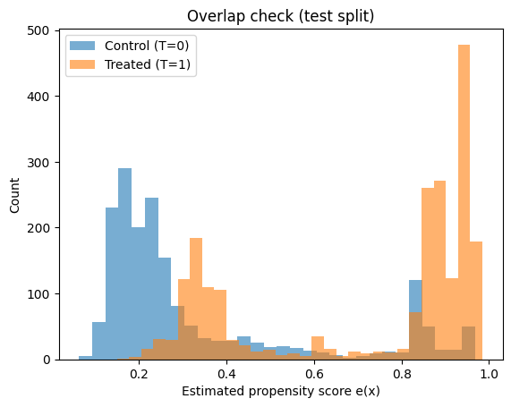
PS range control: (np.float64(0.06305527698131999), np.float64(0.967711808907784))
PS range treated: (np.float64(0.14956967160707563), np.float64(0.984931041276022))
5) ATE via Propensity Score Matching (PSM)
Intuition
PSM tries to mimic a randomized experiment by pairing each treated unit with a control unit that has a very similar propensity score.
Workflow:
- Estimate propensity scores
e(x) - For each treated unit, find the nearest control in propensity space (1:1 matching)
- Compute individual differences
Y_treated - Y_control - Average them → estimated ATE (more precisely, ATT/ATE depending on matching scheme)
What to look for in results
- If the matched pairs are truly similar, the covariate balance should improve.
- The estimated effect should be directionally consistent with IPW (next section), though they won’t match exactly because the estimands can differ (ATT vs ATE).
Limitations:
- Matching quality depends heavily on overlap and on how you match (calipers, replacement, etc.).
- You discard information (unmatched controls).
def propensity_score_matching_ate(df_in, ps, outcome_col="Y", treat_col="T"):
    d = df_in.reset_index(drop=True).copy()
    d["ps"] = ps

    treated = d[d[treat_col] == 1].copy()
    control = d[d[treat_col] == 0].copy()

    nn = NearestNeighbors(n_neighbors=1)
    nn.fit(control[["ps"]].values)

    distances, idx = nn.kneighbors(treated[["ps"]].values)
    matched_control = control.iloc[idx.flatten()].copy()
    matched_control.index = treated.index

    ate_hat = (treated[outcome_col] - matched_control[outcome_col]).mean()
    return ate_hat, distances.flatten()

ate_psm, match_dists = propensity_score_matching_ate(train_df, ps_train)
ate_psm
np.float64(0.7292566492384633)
pd.Series(match_dists).describe()
count    8798.000000
mean        0.000623
std         0.001017
min         0.000000
25%         0.000094
50%         0.000295
75%         0.000717
max         0.017219
dtype: float64
6) ATE via IPW (Inverse Propensity Weighting)
Intuition
Instead of pairing units, IPW reweights the dataset so treated and control groups become comparable.
If someone has:
- high probability of being treated but is control, they get a large weight (rare event)
- low probability of being treated but is treated, they get a large weight (rare event)
This produces a “pseudo‑population” where treatment is independent of X (approximately).
Stabilized weights (used here)
- treated: ( w = P(T=1) / e(x) )
- control: ( w = P(T=0) / (1-e(x)) )
Then:
[ ATE ~ E_w[Y|T=1] - E_w[Y|T=0] ]
Practical warnings
- If
e(x)is near 0 or 1, weights explode → high variance. - Trimming/clipping weights is common in practice.
- Always check balance after weighting (next section).
def iptw_ate(Y, T, ps, stabilized=True, clip=(0.01, 0.99)):
    ps = np.clip(ps, clip[0], clip[1])
    p_t = T.mean()

    if stabilized:
        w = np.where(T == 1, p_t/ps, (1-p_t)/(1-ps))
    else:
        w = np.where(T == 1, 1/ps, 1/(1-ps))

    y1 = np.sum(w[T==1]*Y[T==1]) / np.sum(w[T==1])
    y0 = np.sum(w[T==0]*Y[T==0]) / np.sum(w[T==0])
    return y1 - y0, w

ate_iptw, w_train = iptw_ate(Y_train, T_train, ps_train, stabilized=True)
ate_iptw
np.float64(0.5364296626917167)
pd.Series(w_train).describe(percentiles=[0.5,0.9,0.95,0.99])
count    16152.000000
mean         0.975348
std          1.082926
min          0.485941
50%          0.609900
90%          1.709772
95%          2.536547
99%          5.699585
max         14.101120
dtype: float64
7) Covariate balance check (Standardized Mean Differences)
After matching/weighting, we need to verify we actually reduced confounding in the observed covariates.
A common quick metric is SMD (Standardized Mean Difference).
-
Before adjustment: large SMD means treated/control differ a lot on that covariate. -
After IPW: SMD should shrink toward 0.
Rule of thumb (varies by field):
-
SMD < 0.1 is often considered “good balance”
This does not prove ignorability (unobserved confounding can still exist), but it’s a necessary sanity check: if balance doesn’t improve, the causal estimate is not credible.
def standardized_mean_diff(x, t, w=None):
    x = np.asarray(x); t = np.asarray(t)
    if w is None:
        m1, m0 = x[t==1].mean(), x[t==0].mean()
        v1, v0 = x[t==1].var(ddof=1), x[t==0].var(ddof=1)
    else:
        w = np.asarray(w)
        def wmean(a, ww): return np.sum(ww*a)/np.sum(ww)
        def wvar(a, ww):
            mu = wmean(a, ww)
            return np.sum(ww*(a-mu)**2)/np.sum(ww)
        m1, m0 = wmean(x[t==1], w[t==1]), wmean(x[t==0], w[t==0])
        v1, v0 = wvar(x[t==1], w[t==1]), wvar(x[t==0], w[t==0])

    pooled_sd = np.sqrt(0.5*(v1+v0))
    return (m1 - m0) / pooled_sd if pooled_sd > 0 else 0.0

rows = []
for c in X_cols:
    rows.append([c,
                 standardized_mean_diff(train_df[c].values, T_train, w=None),
                 standardized_mean_diff(train_df[c].values, T_train, w=w_train)])

bal = pd.DataFrame(rows, columns=["covariate","SMD_raw","SMD_IPTW"])
bal
| covariate | SMD_raw | SMD_IPTW | |
|---|---|---|---|
| 0 | lpi | -0.953624 | -0.099442 |
| 1 | fmde | -1.637897 | -0.106434 |
| 2 | physlm | 0.035886 | 0.036546 |
| 3 | disea | -0.072682 | -0.023675 |
| 4 | hlthg | -0.013260 | -0.047128 |
| 5 | hlthf | 0.014376 | 0.000471 |
| 6 | hlthp | 0.085408 | 0.017549 |
8) Meta‑learners for CATE/HTE (S, T, X)
Now we move from “single number” (ATE) to individualized effects.
What is HTE?
HTE = Heterogeneous Treatment Effects
Same as CATE: the treatment effect depends on X.
Example: the effect might be larger for low‑income individuals than high‑income individuals.
S‑Learner (one model)
Fit one model for the outcome:
[ µ(x,t) ~ E[Y |X=x, T=t] ]
Then predict:
[ au(x) = µ(x,1) - µ(x,0) ]
Risk: the model can “ignore” T if the signal is weak relative to X.
T‑Learner (two models)
Fit two separate models:
-
(µ_1(x) ~ E[Y X=x, T=1]) -
(µ_0(x) ~ E[Y X=x, T=0])
Then:
[ au(x) = µ_1(x) - µ_0(x) ]
Strength: cannot ignore treatment
Weakness: each model sees less data → can be noisy when sample sizes are small or imbalanced.
X‑Learner (5 models including treatment propensity model)
X‑Learner is designed to work well under treatment/control imbalance.
High level idea:
- Fit (µ_0, µ_1) (like T‑Learner)
- Create imputed effects for treated and control units
- Learn those imputed effects with second‑stage models
- Blend them using propensity score weights (trust the better‑trained side more)
In practice, X‑Learner often shines when:
- treatment group is much smaller/larger than control
- effect heterogeneity is real (nonlinear patterns)
Next we fit all three and compare the shapes of the estimated ( au(x)).
base_reg = GradientBoostingRegressor(random_state=42)

# ----- S-learner -----
def fit_s_learner(X, T, Y, model):
    X_aug = X.copy()
    X_aug["T"] = T
    m = model
    m.fit(X_aug, Y)
    return m

def cate_s_learner(model, X):
    X1 = X.copy(); X1["T"] = 1
    X0 = X.copy(); X0["T"] = 0
    return model.predict(X1) - model.predict(X0)

# ----- T-learner -----
def fit_t_learner(X, T, Y, model):
    m1 = model.__class__(**model.get_params())
    m0 = model.__class__(**model.get_params())
    m1.fit(X[T==1], Y[T==1])
    m0.fit(X[T==0], Y[T==0])
    return m0, m1

def cate_t_learner(m0, m1, X):
    return m1.predict(X) - m0.predict(X)

# ----- X-learner -----
def fit_x_learner(X, T, Y, ps, model):
    m0, m1 = fit_t_learner(X, T, Y, model)
    mu0 = m0.predict(X)
    mu1 = m1.predict(X)

    D1 = Y[T==1] - mu0[T==1]
    D0 = mu1[T==0] - Y[T==0]

    tau1 = model.__class__(**model.get_params())
    tau0 = model.__class__(**model.get_params())
    tau1.fit(X[T==1], D1)
    tau0.fit(X[T==0], D0)

    return tau0, tau1

def cate_x_learner(tau0, tau1, ps, X):
    g = np.clip(ps, 0.01, 0.99)
    return g*tau0.predict(X) + (1-g)*tau1.predict(X)

# Fit learners
s_model = fit_s_learner(X_train, T_train, Y_train, base_reg.__class__(**base_reg.get_params()))
t_m0, t_m1 = fit_t_learner(X_train, T_train, Y_train, base_reg)
x_tau0, x_tau1 = fit_x_learner(X_train, T_train, Y_train, ps_train, base_reg)

# Predict CATE on test
tau_s = cate_s_learner(s_model, X_test)
tau_t = cate_t_learner(t_m0, t_m1, X_test)
tau_x = cate_x_learner(x_tau0, x_tau1, ps_test, X_test)

pd.DataFrame({"tau_s": tau_s, "tau_t": tau_t, "tau_x": tau_x}).describe().T
| count | mean | std | min | 25% | 50% | 75% | max | |
|---|---|---|---|---|---|---|---|---|
| tau_s | 4038.0 | 0.702560 | 0.401572 | -1.656530 | 0.416886 | 0.682054 | 0.924780 | 2.349528 |
| tau_t | 4038.0 | 0.946680 | 1.890303 | -15.871079 | -0.176488 | 0.797180 | 1.796070 | 15.918720 |
| tau_x | 4038.0 | 0.434019 | 1.510177 | -8.097625 | -0.301993 | 0.264565 | 1.106073 | 14.448459 |
9) Interpreting HTE: bucketed effects by income (a simple story)
Raw individual CATE predictions can be noisy.
A common way to interpret them is to aggregate by a meaningful feature.
Here we bucket by lpi (log income proxy) and compute the mean predicted effect in each bucket.
How to read the output:
- If buckets show a clear trend, that suggests meaningful heterogeneity.
- If buckets are flat, the model is mostly predicting a constant effect (little HTE).
- If buckets zig‑zag wildly, it may be noise / overfitting (common with small data).
This bucket view is not perfect, but it’s a great first interpretation.
def bucket_means(x, tau, n_bins=5):
    b = pd.qcut(x, q=n_bins, duplicates="drop")
    return pd.DataFrame({"bucket": b, "tau": tau}).groupby("bucket",observed=False)["tau"].agg(["count","mean","std"])

income_test = X_test["lpi"].values

print("S-learner")
display(bucket_means(income_test, tau_s, n_bins=5))

print("\nT-learner")
display(bucket_means(income_test, tau_t, n_bins=5))

print("\nX-learner")
display(bucket_means(income_test, tau_x, n_bins=5))
S-learner
| count | mean | std | |
|---|---|---|---|
| bucket | |||
| (-0.001, 5.717] | 1619 | 0.705490 | 0.298005 |
| (5.717, 6.128] | 804 | 0.418382 | 0.251384 |
| (6.128, 6.842] | 807 | 0.806932 | 0.456947 |
| (6.842, 7.164] | 808 | 0.875219 | 0.485807 |
T-learner
| count | mean | std | |
|---|---|---|---|
| bucket | |||
| (-0.001, 5.717] | 1619 | 1.158614 | 1.340204 |
| (5.717, 6.128] | 804 | -0.011154 | 1.470241 |
| (6.128, 6.842] | 807 | 1.231822 | 2.166618 |
| (6.842, 7.164] | 808 | 1.190328 | 2.507926 |
X-learner
| count | mean | std | |
|---|---|---|---|
| bucket | |||
| (-0.001, 5.717] | 1619 | 0.775377 | 1.237697 |
| (5.717, 6.128] | 804 | -0.079043 | 1.316451 |
| (6.128, 6.842] | 807 | 0.308708 | 1.837165 |
| (6.842, 7.164] | 808 | 0.385713 | 1.651644 |
10) Uplift‑style sanity check (practical lens)
In industry (marketing/personalization), you often care about:
“If I target the top‑scoring people by predicted uplift, do I see better outcomes?”
So we do a quick check:
- Rank people by predicted ( au(x))
- Take the top
k% - Compare mean outcome for treated vs control inside that slice
Important caveat:
- This is not a fully rigorous causal evaluation (selection bias can remain)
- But it is a useful directional diagnostic: if your CATE model is meaningful, high‑( au) slices should show stronger treated‑control differences.
Think of it as “does the model pass the sniff test?”
test_eval = test_df.copy()
test_eval["ps"] = ps_test
test_eval["tau_s"] = tau_s
test_eval["tau_t"] = tau_t
test_eval["tau_x"] = tau_x

def uplift_slice_report(df_slice):
    y_t = df_slice[df_slice["T"]==1]["Y"].mean()
    y_c = df_slice[df_slice["T"]==0]["Y"].mean()
    return (y_t - y_c), df_slice.shape[0], df_slice["T"].mean()

for col in ["tau_s", "tau_t", "tau_x"]:
    print(f"\n=== {col} ===")
    for frac in [0.1, 0.2, 0.3]:
        cut = test_eval[col].quantile(1-frac)
        sl = test_eval[test_eval[col] >= cut]
        diff, n, treat_rate = uplift_slice_report(sl)
        print(f"Top {int(frac*100)}%: N={n:5d}, treat_rate={treat_rate:.3f}, (mean Y_t - mean Y_c)={diff:.3f}")
=== tau_s ===
Top 10%: N=  404, treat_rate=0.158, (mean Y_t - mean Y_c)=1.018
Top 20%: N=  809, treat_rate=0.468, (mean Y_t - mean Y_c)=0.922
Top 30%: N= 1213, treat_rate=0.495, (mean Y_t - mean Y_c)=0.622

=== tau_t ===
Top 10%: N=  406, treat_rate=0.177, (mean Y_t - mean Y_c)=3.144
Top 20%: N=  811, treat_rate=0.430, (mean Y_t - mean Y_c)=1.650
Top 30%: N= 1218, treat_rate=0.574, (mean Y_t - mean Y_c)=0.877

=== tau_x ===
Top 10%: N=  407, treat_rate=0.509, (mean Y_t - mean Y_c)=1.541
Top 20%: N=  808, treat_rate=0.630, (mean Y_t - mean Y_c)=1.352
Top 30%: N= 1212, treat_rate=0.678, (mean Y_t - mean Y_c)=0.802
11) Lightweight refutations
Molak emphasizes that causal results can look convincing even when wrong, so we do quick “stress tests”.
A) Placebo treatment
If we shuffle treatment labels T randomly, then any real causal structure is broken.
Expected result:
- ATE should move toward ~0 (up to sampling noise)
If placebo ATE is still large, something is off:
- leakage (using post‑treatment features)
- a bug in estimation
- severe model misspecification
B) Random common cause
Add a random noise covariate to X and refit.
Expected result:
- ATE should not change dramatically (noise shouldn’t suddenly explain away confounding)
These refutations don’t prove correctness, but they help catch embarrassing failures early.
# A) Placebo
T_placebo = np.random.permutation(T_train)

prop_placebo = Pipeline([("scaler", StandardScaler()),
                         ("logit", LogisticRegression(max_iter=2000))])
prop_placebo.fit(X_train, T_placebo)
ps_placebo = prop_placebo.predict_proba(X_train)[:, 1]

ate_placebo, _ = iptw_ate(Y_train, T_placebo, ps_placebo, stabilized=True)
print("IPTW ATE with PLACEBO treatment (should be ~0):", ate_placebo)
IPTW ATE with PLACEBO treatment (should be ~0): -0.038421383093159456
# B) Random common cause
train_aug = train_df.copy()
train_aug["noise"] = np.random.normal(size=train_aug.shape[0])

X_aug = train_aug[X_cols + ["noise"]]

prop_aug = Pipeline([("scaler", StandardScaler()),
                     ("logit", LogisticRegression(max_iter=2000))])
prop_aug.fit(X_aug, T_train)
ps_aug = prop_aug.predict_proba(X_aug)[:, 1]

ate_aug, _ = iptw_ate(Y_train, T_train, ps_aug, stabilized=True)
print("Original IPTW ATE:", ate_iptw)
print("Augmented IPTW ATE (with random noise covariate):", ate_aug)
Original IPTW ATE: 0.5364296626917167
Augmented IPTW ATE (with random noise covariate): 0.5368559807542961
12) Wrap‑up
The big picture
- Propensity scores are your gateway to diagnosing whether causal estimation is even plausible (overlap).
- Matching / weighting target ATE (one average number).
- Meta‑learners target HTE/CATE (who benefits more).
What we learned in this notebook
- S‑Learner is simple and often strong, but can under‑use treatment if the model decides
Tis unimportant. - T‑Learner forces treatment separation, but can be noisy because each model sees fewer samples.
- X‑Learner tries to get the best of both worlds by:
- using both outcome models
- creating imputed effects
- weighting/blending based on propensity (trust the side with better information)
When to use what (practical cheat sheet)
- Start with S‑Learner if you want a baseline quickly.
- Consider T‑Learner if treated/control sizes are similar and you have plenty of data.
- Consider X‑Learner if treatment is rare/common or you suspect strong heterogeneity.